The Space Between: How Leaving Your Canvas Empty Makes Your Art Louder
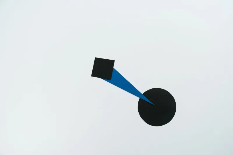
There's a quiet anxiety that creeps up on a lot of illustrators and designers when they look at an unfinished piece. All that open canvas. All that white. The instinct — especially early in your creative journey — is to fill it. Add a texture here, throw in a background element there, maybe squeeze in a little detail that wasn't in the original sketch. Before you know it, the composition is packed, and somehow the piece feels like it's saying less.
Negative space is the antidote to that instinct. And once you truly internalize how it works, you'll start seeing it everywhere — in your favorite logos, in the editorial illustrations you've bookmarked on Pinterest, in the album covers that made you stop mid-scroll.
What Negative Space Actually Is (And Isn't)
Let's clear something up right away. Negative space isn't just "the background." That framing makes it passive, like it's just hanging around waiting for the real art to show up. Negative space is active. It's the deliberate shape created by the absence of your subject — and when it's handled well, that absence has its own visual weight, its own meaning, its own pull on the viewer's eye.
The classic textbook example is the FedEx logo, where the arrow hidden between the E and the X has become almost legendary in design circles. It wasn't an accident. Aaron Draplin, one of the most celebrated graphic designers working today, has talked extensively about how negative space functions as a second layer of communication — a reward for the attentive viewer. That arrow doesn't just look clever; it reinforces the brand's entire message about speed and direction without adding a single extra element.
In illustration, the principle works a little differently but just as powerfully. Think about the work of Saul Bass — his film posters for Anatomy of a Murder or Vertigo use stripped-back compositions where the negative space isn't just empty; it creates tension. The eye has nowhere to rest except exactly where Bass wants it.
How Negative Space Guides Attention
Here's the thing about human perception: our eyes are drawn to contrast and to edges. When you surround a focal point with open space, you're essentially building a visual runway that lands the viewer's gaze exactly where you want it. Negative space is a direction arrow that doesn't announce itself.
Editorial illustrators use this constantly. When a magazine like The New Yorker runs a cover with a single figure against a flat, open background, the entire emotional weight of that image concentrates on the character. Every expression, every posture detail becomes amplified because there's nothing else competing for attention.
Contrast this with a heavily detailed illustration where every inch of the frame is occupied. That kind of density can be absolutely stunning — think of the intricate world-building in fantasy art or the layered textures of certain concert posters. But it asks something different of the viewer. It invites exploration rather than directing focus. Neither approach is wrong. But understanding which one serves your story is everything.
Real-World Examples Worth Studying
If you want to train your eye for negative space, these are worth spending some time with:
Album Covers: Joy Division's Unknown Pleasures is almost entirely negative space — that white radio wave pulse on a black field. It's been reproduced on a million t-shirts because the composition is so stark and confident. The emptiness around that signal makes it feel like it's transmitting from the void.
Logo Design: The WWF panda logo is another one. The white space within the shape isn't just coloring — it defines the animal. Remove it and you lose the whole thing. The negative space is the panda.
Editorial Illustration: Christoph Niemann's work, which has graced The New York Times and National Geographic, frequently uses negative space to create dual readings — an image that's one thing at first glance and something else entirely when you shift your perception. That double-meaning trick only works because the negative space is carrying half the visual information.
The Emotional Register of Empty Space
Beyond guiding attention, negative space communicates mood in ways that are almost subconscious. Wide open space around a figure tends to evoke isolation, calm, or contemplation. It can feel meditative or, depending on context, deeply lonely. Think about how differently a character reads when they're surrounded by chaos versus when they're standing alone in a field of white.
For character designers especially, this is worth experimenting with. Try placing the same character sketch in three different compositional contexts: crowded, moderately spaced, and radically minimal. The character's emotional story shifts each time without you changing a single line of the figure itself. That's the power of negative space as a storytelling device, not just a layout choice.
Practical Exercises to Start Using Right Now
Ready to actually work with this? Here are a few exercises that working illustrators use to build negative space awareness:
The Silhouette Test: Flatten your illustration to a single solid silhouette. Does the shape read clearly? Is the negative space around it interesting on its own? If the silhouette is muddy or forgettable, your composition probably needs more breathing room.
The 30% Rule: Before you add any new element to a composition, ask yourself: does this reduce my negative space below 30% of the frame? If yes, it better be doing something really important. This isn't a hard law, but it forces intentional decision-making.
Reverse Sketching: Instead of drawing your subject, draw the negative space around it. Sketch the shapes that your subject isn't. This rewires how your brain sees a composition and often reveals opportunities you'd never notice otherwise.
The Cover Crop: Take a finished piece and try cropping it aggressively to eliminate background detail. Sometimes the strongest version of an image is hiding inside the one you already made, just waiting for you to take away the noise.
Leaving Room for the Viewer
There's a philosophy underneath all of this that goes beyond technique. When you leave space in your work — real, intentional, confident space — you're doing something generous. You're leaving room for the viewer to bring something of themselves to the image. You're trusting the composition to do its job without over-explaining.
The pencil knows when to stop. The best illustrators and designers know it too. Next time you're tempted to fill that empty corner, pause for a second and ask: what if the empty corner is the whole point?